Multiple images inside one container
System Design practice on Codemia
Work through 120+ system design problems with detailed solutions, from rate limiters to multi-region storage.
Introduction
Putting multiple images inside one container is a normal web-layout task for galleries, comparison cards, product grids, and collages. The key is not just placing the images in one wrapper element, but controlling sizing, spacing, cropping, and responsiveness so the layout behaves well across different screens.
Basic HTML Structure
A simple container can hold as many images as you need.
The real layout behavior comes from CSS.
Use CSS Grid For Structured Layouts
Grid is usually the easiest choice when you want neat rows and columns.
This creates a two-column layout where every image fills its cell and is cropped cleanly with object-fit: cover.
Use Flexbox For Simpler Rows
If you only need a row or wrapping strip of images, Flexbox can be enough.
Flexbox is good for simpler one-dimensional arrangements. Grid is usually better when the layout has both rows and columns that need stronger control.
Responsive Behavior
A fixed desktop layout often fails on smaller screens. Responsive grid definitions solve that cleanly.
With this pattern, the number of columns adjusts automatically based on available width. That keeps the images readable without separate mobile markup.
Handling Different Image Shapes
Real-world image sets rarely share the same dimensions. If you do nothing, mismatched aspect ratios can make the container look uneven.
A practical approach is to let the container define the display ratio and use object-fit:
- '
coverfills the box and crops excess' - '
containpreserves the whole image but may leave empty space'
For gallery-style layouts, cover is usually the better choice because it creates a tighter visual grid.
Add Captions Or Overlay Content
A container can also hold image cards instead of bare img tags. That is useful when each image needs a label or action.
This keeps the content semantic and makes the container easier to style as a reusable component.
Accessibility And Performance
Each image should have meaningful alt text unless it is purely decorative. That makes the container accessible to screen readers and improves overall document quality.
For performance, consider lazy loading:
That reduces initial page cost when a container holds many images below the fold.
Common Pitfalls
A common mistake is setting only the container layout and forgetting to control image sizing. Without width, height, or object-fit rules, the images can stretch or overflow unpredictably.
Another mistake is using fixed widths that work only on desktop. Responsive CSS avoids layouts that collapse on phones.
It is also easy to neglect accessibility. A multi-image container is still a set of real content images, so alt text matters unless the images are decorative only.
Summary
- Put multiple images in one wrapper element and control the layout with CSS.
- Use CSS Grid for structured galleries and Flexbox for simpler strips.
- Add
object-fitand aspect-ratio rules so different image sizes behave consistently. - Make the layout responsive with
auto-fitandminmaxwhen possible. - Include alt text and consider lazy loading for accessibility and performance.
Related reading
- Multiple RUN vs. single chained RUN in Dockerfile, which is better?
- My docker container has no internet
- My kafka docker container cannot connect to my zookeeper docker container
- Mysterious Filebeat 7 X-Pack issue using Docker image
- Multiple user inputs using Nodejs
- MySQL with Node.js
- naming to docker.io, explanation and prevention?
- Need help troubleshooting a .NET Core 2.1 API in a linux Docker
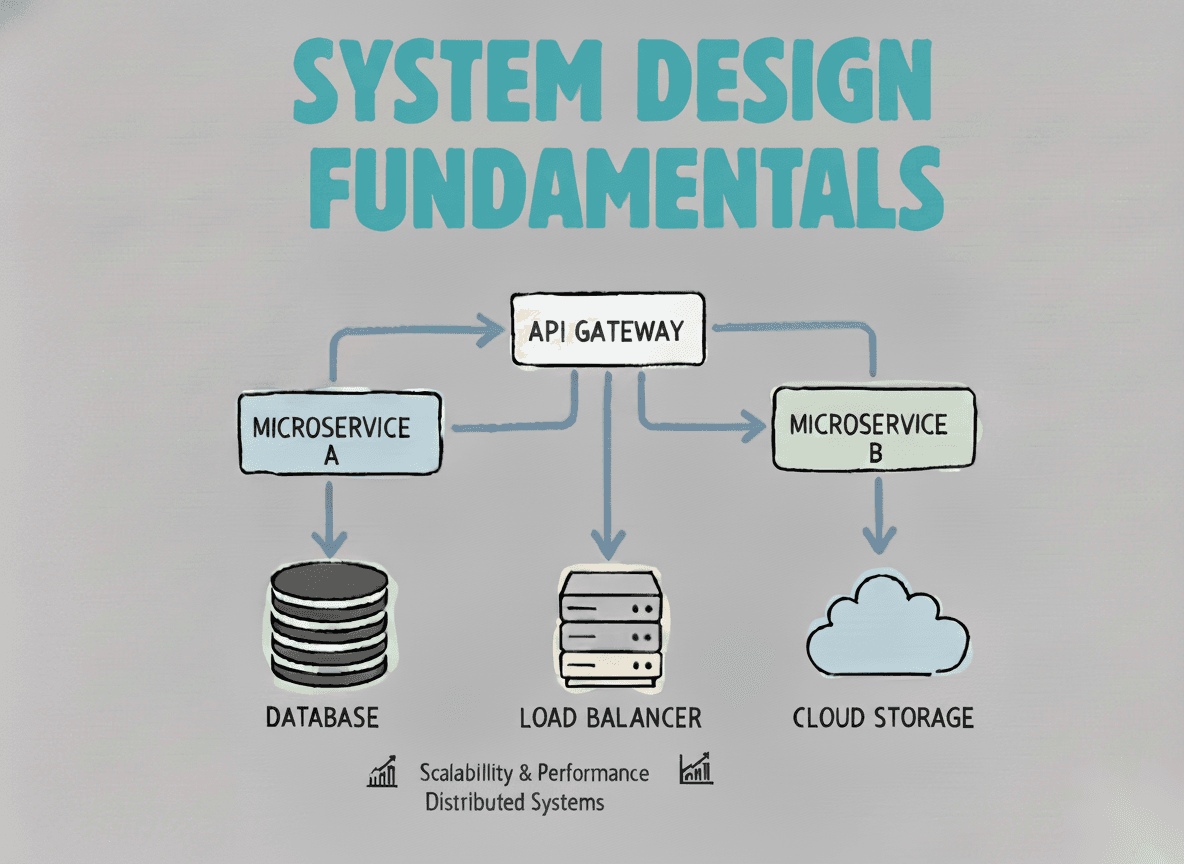
System Design Fundamentals
Build a strong foundation in designing scalable, reliable distributed systems.
View the courseSystem Design practice on Codemia
Work through 120+ system design problems with detailed solutions, from rate limiters to multi-region storage.