How to get the Stackdriver charts into a csv file?
ML System Design practice on Codemia
Design recommenders, ranking systems and training pipelines the way ML interviews actually ask for them, with worked solutions.
Introduction
What used to be called Stackdriver is now Google Cloud Monitoring, but the basic export idea is the same: a chart is a visualization of time-series data, not the export object itself. If you want CSV output, you need to reproduce the metric query behind the chart and then write the returned points into a file.
Start With the Metric Query, Not the Picture
A dashboard chart usually depends on several pieces of configuration:
- metric type
- monitored resource type
- label filters
- alignment period
- reduction settings
- time range
If you export only the raw metric type and ignore the rest, the CSV will often fail to match the chart. That is why the first step is identifying exactly how the chart was built in Metric Explorer or the dashboard definition.
Query the Data with Cloud Monitoring
The practical export path is to call the Cloud Monitoring time-series API and then flatten the result into rows. A Python example keeps the workflow clear:
This pattern does the real work behind a CSV export: fetch the data points and serialize them explicitly.
Match the Chart Aggregation
The most common reason exported data looks wrong is aggregation mismatch. Cloud Monitoring charts often align points to windows and may reduce or group multiple series before rendering. If your API call omits those settings or uses different values, your CSV may be valid but still not match the chart the user sees.
So when numbers disagree, compare:
- alignment period
- aligner type
- any cross-series reduction
- grouping labels
- the exact time interval
That usually explains the difference faster than debugging the CSV code itself.
Preserve Labels in the CSV
Many monitoring charts contain more than one line. If you export only timestamp and value, the CSV may become hard to interpret because you lose which resource or label combination produced each point.
For multi-series charts, include resource labels or metric labels as extra columns. Otherwise the export is technically correct but operationally weak because the context is gone.
Authentication and Permissions
The export code also depends on valid Google Cloud authentication. On a developer workstation, that often means application default credentials. In CI or production, it often means a service account with Monitoring read permissions.
If the query fails before returning data, check credentials and project selection before assuming the chart logic is wrong.
Common Pitfalls
Treating the chart image or dashboard view itself as though it were the export source leads to the wrong workflow. The real source is the monitoring query.
Ignoring aggregation settings is the fastest way to get a CSV that does not match the visual chart.
Dropping resource and metric labels can make multi-series exports useless once they leave the monitoring tool.
Using a different time range from the chart produces correct data for the wrong interval.
Expecting one universal "download chart as CSV" action for every chart view is unreliable because the chart is only a rendering of the underlying series data.
Summary
- Stackdriver charts are visualizations of Cloud Monitoring time-series queries.
- Exporting to CSV means reproducing the query and serializing the returned points.
- Match the chart's metric filters, aggregation, and time range if you want the same numbers.
- Include labels in the CSV when more than one series is involved.
- Check authentication and project context before debugging the export logic.
Related reading
- How to get the value of a tensor? Python
- How to get the weight vector in Logistic Regression?
- How to get/set a pandas index column title or name?
- How to graph grid scores from GridSearchCV?
- How to get the status of a particular pod or container kubectl get pods using jsonpath
- How to gracefully remove a node from Kubernetes?
- How to group dataframe rows into list in pandas groupby
- How to handle a situation of feature scaling in machine learning model deployment when you have only one testing instance?
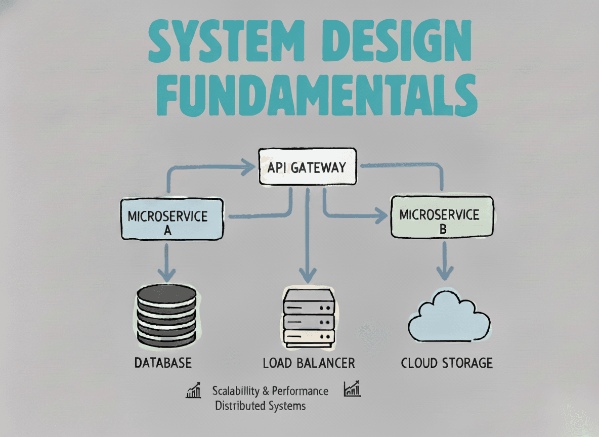
System Design Fundamentals
Build a strong foundation in designing scalable, reliable distributed systems.
View the courseML System Design practice on Codemia
Design recommenders, ranking systems and training pipelines the way ML interviews actually ask for them, with worked solutions.